How to use our logo
Acceptable use
When we talk about THE BRAND at Oklahoma State, we refer to both the OSU Brand mark that we proudly wear — and what makes us proud to wear it.
While branding can start with logos, school colors and uniforms, it extends to the greater image that we want to portray Oklahoma State at home, across the country and around the world.
The OSU Brand was originally introduced in the 1970s and was meant to evoke the western heritage of Oklahoma and the “Cowboys” name by mimicking the design of a traditional cattle brand.
The brand made its first appearance on a football helmet in 1973 and has remained
there ever since, although it has undergone some design changes over the decades.
While the brand has been in constant use in OSU Athletics for almost 50 years now, it hasn’t always been the logo for Athletics.
During that time, the Brand was joined by the Block O-State, Pistol Pete and the interlocking OS as marks that all represented OSU, but their use was consistently inconsistent. Fans and alumni could see any of these marks representing OSU from uniforms to merchandise to sportscasts on television.
OSU’s logos underwent a redesign in 2001 and the updated OSU Brand increasingly became the focal point of Athletics branding from that point forward.
In 2019, the Brand was updated and adopted across all campuses, colleges, departments and units. Now, we have one Brand for all.
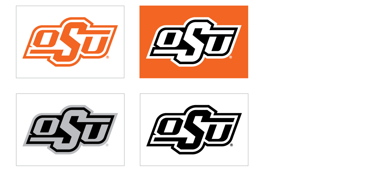
Acceptable color variations
PRIMARY USE | FULL COLOR

SECONDARY USE | PREFERRED
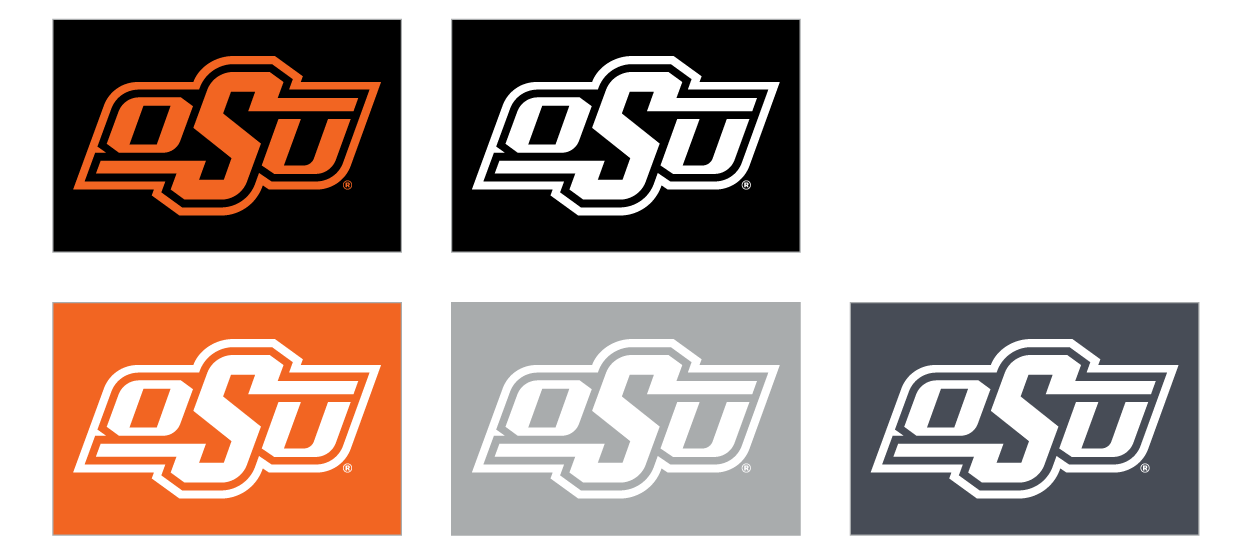
SECONDARY USE | LIMITED
Acceptable margins and spacing
A certain amount of breathing room from the edge of a page/document should be allowed, as well as from other text and design elements on the page.
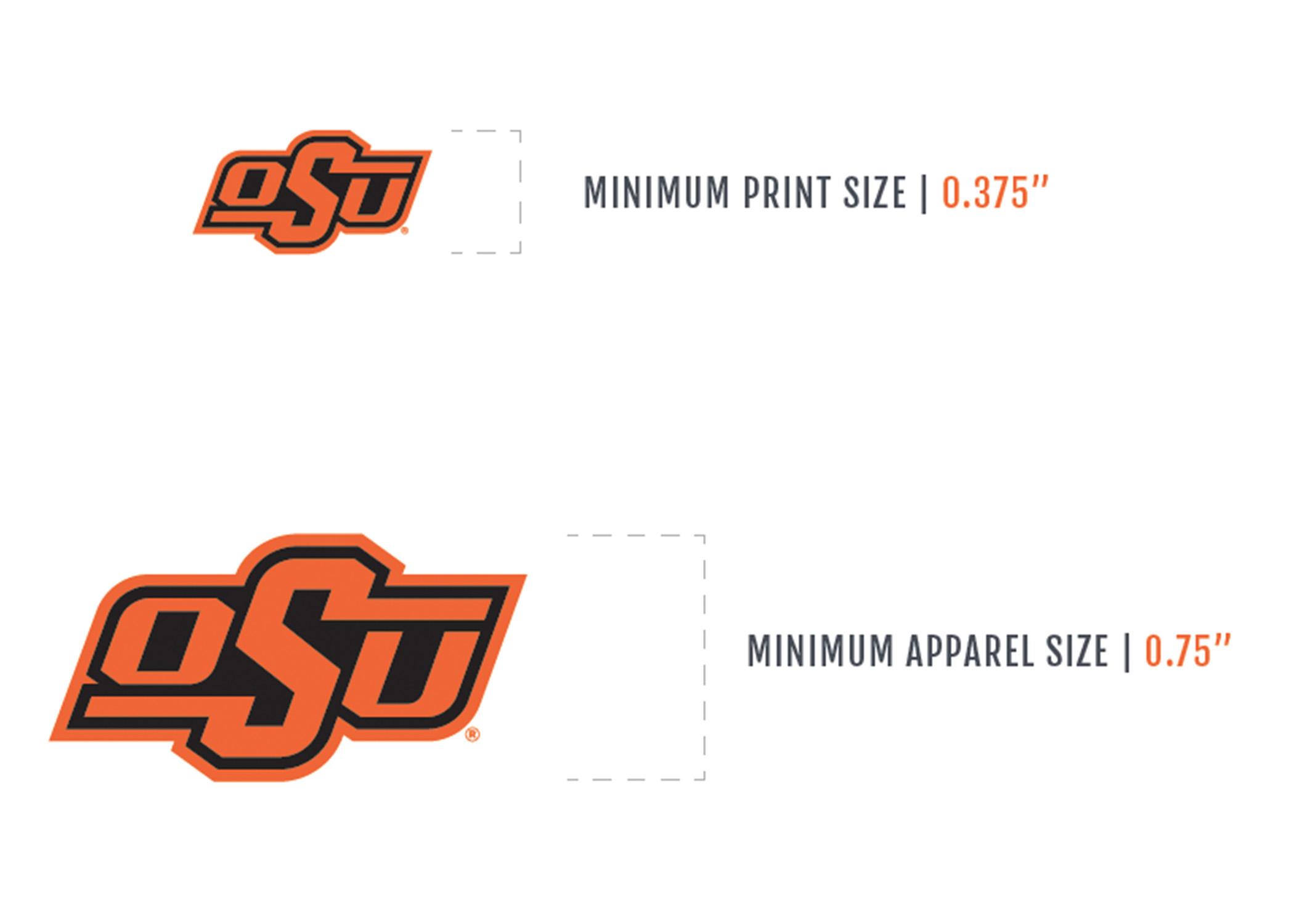
MINIMUM SIZE SPECIFICATIONS
The Brand should not be resized smaller than 0.375” in any print format to ensure legibility.
For use on apparel and merchandise — especially regarding embroidery — we recommend that the brand not be resized below 0.75” to maintain the mark’s integrity on the finished product.
MARGINS
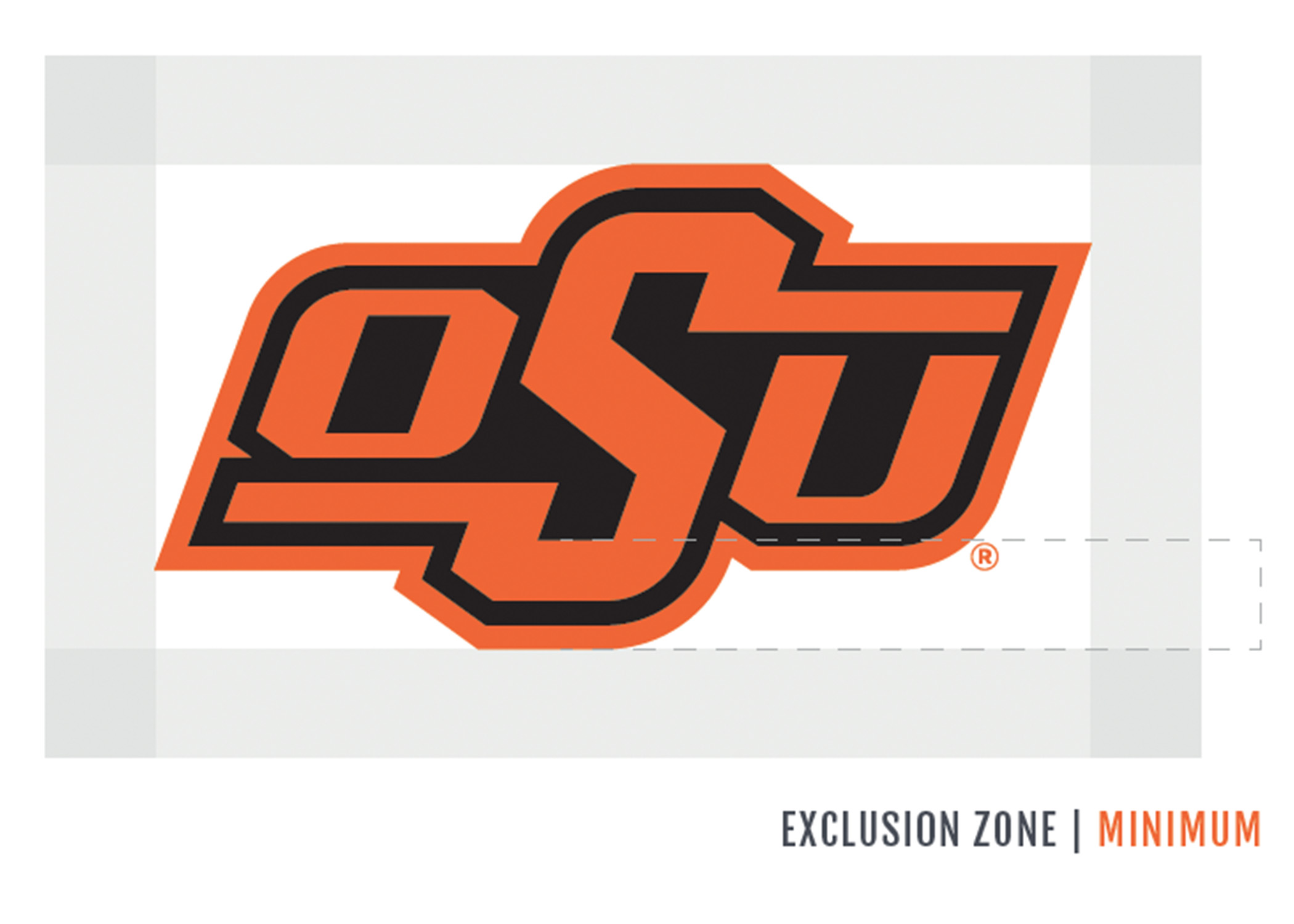
As a rule, the Brand — in any of its variations — should not be placed within one-half the width or one-half the height of the logo from the side edges or the top or bottom edge of a page.
Other text and design elements on the same page as the Brand — in any of its variations — should not be placed within a distance less than the height from the inside of the S-stroke to the exterior edge of the logo. This padding is referred to as the exclusion zone.
Acceptable co-branding
OSU has licensing and trademark agreements in place to properly commercialize the brand. Campaigns, initiatives, signage, promotional materials or other media that require co-branding with companies or outside entities must be coordinated through the office of trademarks & licensing. University campuses, colleges and departments need approval before placing unauthorized third-party logos or branding on institutional property or programs.

Unacceptable use
The entire logo must be used when designing. While it may be enlarged or reduced, it should be done proportionally and not distorted in any way when resized. The fundamental principles of good design should be employed in all marketing materials to ensure the highest quality standards. Send questions about the proper use or resizing of logo files to brandosu@okstate.edu.
Improper color
The logos, wordmarks and positioning statement should never be reproduced in any color other than the official colors.

Distracting backgrounds
The logos, wordmarks and positioning statement should never be reproduced over backgrounds that overpower, distract, clash or have similar color values.


Alterations
The logo, wordmarks and positioning statement should not be altered, stylized, outlined or distorted.

Layered
No portion of the logos, wordmarks or positioning statement should be obscured.

